JeffSelingo.com
Roles: Website Design + Development
Website Design
Jeff Selingo is a NY Times bestselling author who is an expert in the college admissions process. When we started working on his site we needed to consider many different potential users seeking information about him or scheduling him as a keynote speaker. Therefore the site needed to be easy to find different channels of information: consulting, books, and events. We needed to incorporate videos and images and make sure there was a sense of depth and gravitas to the design.
Lots of opportunities to see resources, events, and also newsletter signups were very important. We integrated Hubspot forms into the website to make sure it was easy for marketing to work to create opportunities for sending resources and newsletters to site visitors that may hear of Jeff in a TV interview, podcast, or as a keynote speaker.
Design Vocabulary
The vocabulary words we based the site designs on were:
Depth
Gravitas
Direct
Exacting
We used this vocabulary to inform the design and how content was displayed. This was an opportunity to build on an existing brand and show many avenues of options available, not only is he an author, but also a consultant, thought leader and speaker.
HelloMrsSykes.com
Roles: Brand Refresh, Website Design + Development
Website Redesign
This year we had the opportunity to design a really fun website for Jennifer Sykes’ store HelloMrsSykes.com, where teachers can get her expert literacy learning materials. She was ready to level up and consolidate from a blog with a separate third-party store on Teachers Pay Teachers to a full e-commerce site.
We wanted to use bright colors and shapes to create a sense of fun, but kept them abstract to not fall into the rut of using apples and animals to imply “teacher.” The ideal client is (of course) an adult teacher, but the materials are specialized for grades 3-5, so keeping them fun but targeted to a slightly older age group was a factor we considered in the design process. The kids have to find the materials interesting as well!
We also gave the HelloMrsSykes brand a small update, going for simplicity with the original block letters but using brighter colors.

SunnyShadeUp
Roles: Branding, Packaging Design, Web Design
Branding
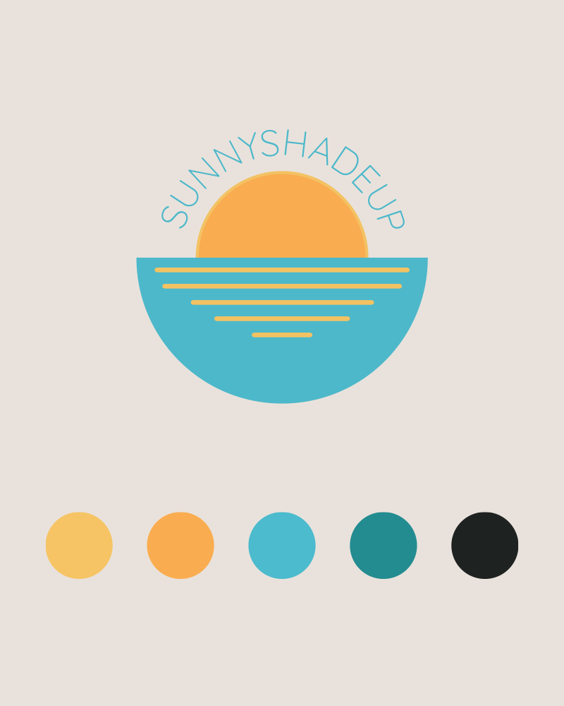
Many people want to enjoy an active outdoor lifestyle but are required to reduce exposure to the sun’s harmful rays. SunnyShadeUp provides access to new and fun sun care products that block harmful sun exposure and also reduce chemical exposure and harm to the environment.
For branding SunnyShadeUp, I wanted to evoke the feelings of relaxation and confidence. My client is a skin cancer survivor and we wanted to show that there is a way to feel confident again about getting back outside and doing the outdoor activities you love while protecting yourself. I channeled the happy colors of a sunrise out on the beach or lake with the cool colors and scenery of peaceful waters.
Packaging
Mailer boxes for products needed to pull in the brightness of the brand. On the inside of the boxes I included patterns of sea creatures that have been affected by toxic chemicals and pollution in the ocean to reinforce the idea of sun care with minimal environmental impact.
We wanted to delight the recipient with a beautiful box when they opened their package in the mail. Because nothing is more fun than getting a package in the mail!
Pattern Design
As a part of the packaging design project I came up with a bunch of cute patterns of undersea life and days at the beach. I wanted to represent the fun of a day at the beach and ocean life while also sending a message about what using environmentally conscious sun care products really means–protecting the beaches and ocean wildlife that we appreciate.
Pre-made patterns offer versatility in products and future designs because they are an easy way to make something visually interesting and pull in brand colors.
My favorite patterns are the whale sharks swimming with jellies and the coral!
Website
For the website the client and I wanted to pull in the bold, bright colors and fun shapes of the sea and sun. The priority for the site was giving the customer easy access to the sun care products that the client knows will be helpful and keep them safe. We wanted to keep it light, fun, and carefree.
One of the challenges that we had was quickly creating an e-commerce website for products by the time summer rolled around. I decided on creating a custom Squarespace theme for this project to utilize the easy setup and many features. The best thing about this site is how easy it is for the client to go in and edit content and add products!
Another key feature of the site was making sure that it would scale with time and growth. I worked in a blog feature and a mailing list to make sure the client was set for future business projects.
Askew House
Roles: Branding
Branding
Askew House is a gourmet plant-based restaurant that is coming soon to downtown Raleigh. The restaurant concept is a collaboration between Bittersweet’s Kim Hammer and Fiction Kitchen’s Caroline Morrison and will allow Chef Caroline to showcase her amazing vegan and vegetarian fine dining.
The Askew-Taylor building is significant to me because it housed the shop where I bought all my art supplies while I was in Design School at NC State (and for many years after). The building itself holds a special spot in so many people’s hearts and memories as it was a staple of downtown Raleigh. We wanted to pay homage to the building structure with architectural line work. Also, we wanted to incorporate the history of the place as an art store and paint shop with painterly swashes and brush-like carrots.

Matthew Deal
Roles: Branding, Icon Design, Web Design
Branding
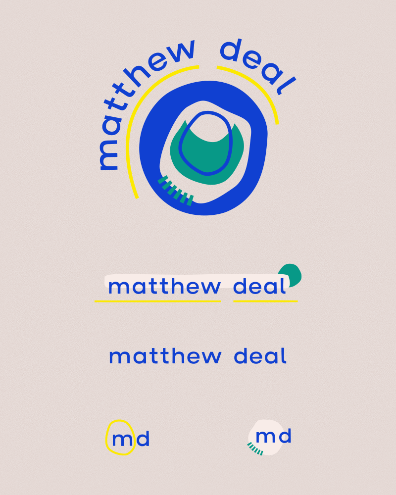
For Matt’s brand I wanted to work with organic and abstract shapes. The shapes themselves are inspired by animal cell structures and the art of 20th century abstract artists Joan Miró and Kenneth Noland (a subtle nod to my love of modern art). We talked about creating a brand that had a confident and unique personality but wasn’t too “marketer-y”.
The collage details and lack of straight lines give this brand a fun and organic feel, which plays up the client’s ability to connect with his client and be helpful to their business.
Icons
I wanted to further the brand by creating some illustrative icons to use throughout printed materials and a website. Some of the icons are abstract, like the symbols in the logo, and some are representational for the specific services that are offered.
Website
I collaborated with the client on the website, customizing an existing Squarespace theme and creating guidelines for creating graphics and page sections. The result was that he could go into the site and create pages with ease without worrying about the design, but customizing the layouts based on the content.
The Digital Custodian
Roles: Branding
Branding
When I was talking with Dan, the owner of the business, we kept talking about the philosophy behind his business. His idea of success is to work with a group of people to clean, improve, and maintain their process using a collaborative and empathetic approach. He doesn’t use a specific approach, but borrows from multiple techniques to implement realistic and measurable solutions.
For visual inspiration we kept talking about the pattern of the number 3, especially in the tagline: “Clean. Improve. Maintain.” We also noticed the cyclical nature of the process that the clients go through, no matter what approach they take. A triple infinity symbol represents movement, unity and continuity–a perfect representation of the consulting process.
I also wanted to focus on water, representing fluidity and flexibility, motion and renewal. Koi fish also came to mind, representing perseverance and a subtle nod to Kaizen, a Japanese method which is the inspiration for the client’s process. Koi also have a stark contrast to the water in the pond, and I love the vibrant shades of orange that they can add to the blue water.
The type treatment is very elegant and modern. For a consultant that is coming into a business and working with others I wanted to establish an air of wisdom and polish but not be over-pretentious, so I went bold, crisp and geometric!

TheDigitalCustodian.com
Roles: Website Design + Development
Website Redesign
For Dan’s Squarespace site, we wanted to dive deeper into the zen design aspects in his branding, while also giving the site some movement and integrating some humor in places. So, quite a challenge! The sleek design and animations are very tech-forward, but we’ve added in some easter eggs here and there and (for better or worse) gotten into some meme territory with blog post thumbnails.
Some of the pages were custom development done in Squarespace, such as the SLAKK page and the Services page. This is stuff you can’t get without a seasoned developer working on your Squarespace site!
Raleigh Durham USBG
Roles: Branding
RDUSBG Branding Suite
When the Raleigh Durham chapter of the US Bartender’s Guild sent out a call for submissions to bid on creating their logo I decided to enter and I won! I was grateful that the members of this organization chose me to work on their logo.
For branding RDUSBG, I was challenged with combining symbolism from two separate cities as well as bartending tools. There’s a lot of movement in bartending that is captured in this branding. I wanted to use the typical imagery of the two cities and portray that movement in a fresh way.
The bright colors come from the flags of both cities. The main yellow and green colors are pulled from citrus fruits like lemons and limes that are often used as cocktail garnishes. I had a lot of fun creating this branding system that is bright and fun and shows the two communities coming together to further their careers and support each other!

Georgia Ponton Photography
Roles: Branding
Branding
When we talked about what Georgia was looking for in a brand, we decided on a high-end looking logo for her business with a calming and serene beach sunrise colors color palette. The circular main logo was also inspired by a postmark stamp which plays to the classy vintage feel of the branding suite. Colors were chosen to match the majority of her portfolio work. Those colors lift the vintage designs into a more modern look. Playful patterns give the brand some visual and playful interest so it doesn’t stay too serene.
Damaged Goods Radio Podcast
Roles: Branding
Moodboards
Using mood boards to set the mood, tone and color palette of the brand I’m working on is very important to set the client’s expectations of what they are going to receive in the first round of branding ideas. I always get feedback to make sure the colors and imagery are on track.

Gather & Glow
Roles: Branding
Branding
When I was discussing branding concepts with the client we were inspired by scientific illustrations and how we could meet that with a quirky, illustrative twist. The wing is a cicada wing, representing the cyclical nature of vintage and upcycled clothing and how something that is no longer used by someone else could be interesting and beautiful to another person. We pulled colors from vintage scientific illustrations and incorporated some fun hand-drawn elements to the branding.
Mix and Match Branding
With a newer business with lots of goods to sell the need for scalability is very important. There’s packaging for shipping, tags, multiple retailer outlets like Poshmark and Etsy and an online presence, among other future uses of the brand. Having the ability to use parts and pieces of the logo and be flexible with the branding was important. I separated out the different parts and pieces of the logo to be able to make stamps for whatever needs may arise!
SKETCHES
One Raleigh
Roles: Branding, Web Design, Web Development
Branding
We wanted the logo for the brand to be something quintessential to the view of downtown Raleigh, itself, but since the city is always growing, the skyline is ever-changing. Something that doesn’t change as much is the shape of the city grid. Raleigh has some interesting shaped intersections (for better or worse) and we focused on the intersections of Boylan Avenue and Hillsborough Street for the basis of the logo. The staggered streets created a great base for the cut paper collage look of the brand.
WEB DESIGN & DEVELOPMENT
The most important focus of the website for this brand was to create a fun design, but keep even the simplest black and white design mysterious. All their projects are in production so we can’t include them as website content, currently. There’s a bunch of easter eggs and an aura of mystery to the design. The bulk of the inspiration for this site was movie credits designed by Saul Bass with slightly animated, collage-y elements that scroll with the content.

Bittersweet
Roles: Branding, Web Design, Web Development
Branding
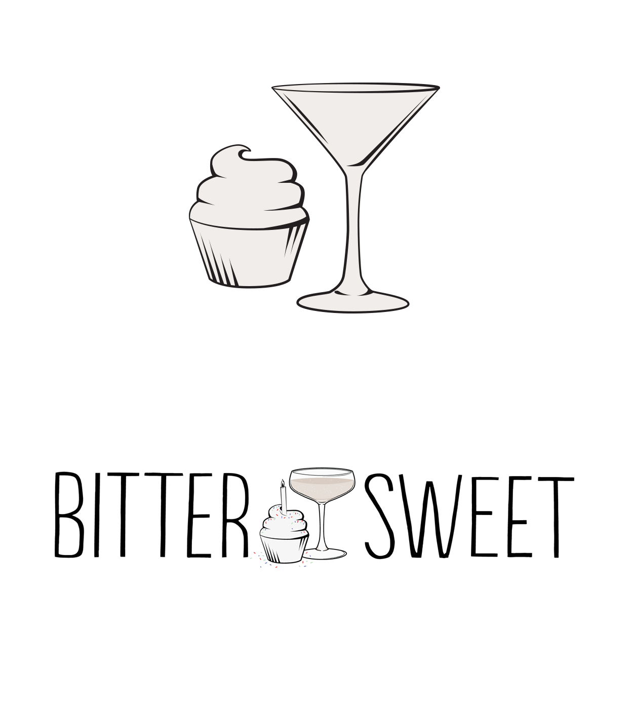
For the logo for Bittersweet, I wanted to work with my client’s concept of a bar where customers could come together over a gin cocktail or an Irish coffee and pecan pie. I used hand-drawn looking type with accents of crafty conversation bubbles and a dessert-worthy color palette to achieve that look. As time has gone on, we realized that the most primary use of the logo was on darker, chocolate-colored backgrounds and have gone with a flattened style.
Branding Details
The cupcake and martini glass were part of the original logo concepts, and now they are used as accents throughout the brand. The cupcake, itself, plays homage to the roots of the owner, who started off running a successful home-based cupcake bakery.
The birthday logo was created to celebrate the 4-year anniversary of the bar. I changed the martini glass out for a celebratory glass of champagne.
Website Design
The website for Bittersweet was an important part of the face of their business. It needed to be informational and showcase their delicious cocktails and desserts. Bold strips of color hold important features, as I wanted to carry consistency of the slightly off-kilter, handmade vibe of the brand into the web presence. Event features on the top of the homepage and a large Instagram feed were essential. Secondary to that and sandwiched in-between are the two most frequently asked questions when people called in: “What are your hours?” and “Where are you located?”
I developed this site in Wordpress so that it would be super easy for the client to go in and make content updates and add images. As we knew most people would be viewing the site on their phones, having a responsive site was of the utmost importance. I created their theme from scratch working in PHP, HTML, using Sass for styling.
Raleigh Provisions
Roles: Branding
Branding
When the client came to me and said they were opening a corner store in downtown Raleigh that would sell awesome local goods, my mind immediately flew to bodegas, an inspiration from my most recent trip to NYC. I researched hand painted bodega signage and vintage gas station signs and had a lot of fun drawing many different options for what would become the signature RP mark.
Behind the Scenes
Ideation starts for me with a pencil (BIC mechanical or a 6B drawing pencil for early prototypes), a Molskine notebook, and a kneaded rubber eraser. I split out concepts and draw anywhere from 5 - 20 ideas for those concepts in each section. Once I’m done purely brainstorming, I’ll go back in and choose around 3 - 5 of my best ideas to explore more. Narrowing that down even further, I will take those more final sketches into illustrator to trace and refine the sketch.
I created the branding board below to show the client the concepts as a round of revision. That way, they could see the finished logos and get more insight into my direction for the brand.


